Overview
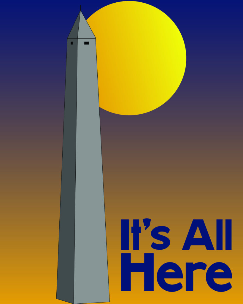
This poster series was created to celebrate four U.S. states through bold, modern travel posters. Each design highlights an iconic monument or landmark, paired with the state’s official slogan and a color palette inspired by the state flag. The goal was to create a cohesive series where each poster stands on its own while feeling visually connected as a set.

Iterations
Each poster went through multiple rounds of digital refinement:
– Adjusting monument silhouettes for clarity and visual impact.
– Experimenting with gradient backgrounds to mimic sunset palettes, evoking warmth and optimism.
– Fine-tuning typography for hierarchy and legibility against bold colors.
Concept Development & Sketches
The initial concept began by identifying a recognizable monument or landmark for each state. I wanted to pair these landmarks with each state’s slogan and use the state flag’s color palette to create visual harmony. The idea was to merge traditional symbols with a modern, bold graphic style.
Early Sketch Concepts:
– Monument ideas, color swatches, and slogan placement.
– Quick layout thumbnails to explore composition and balance.
Example:
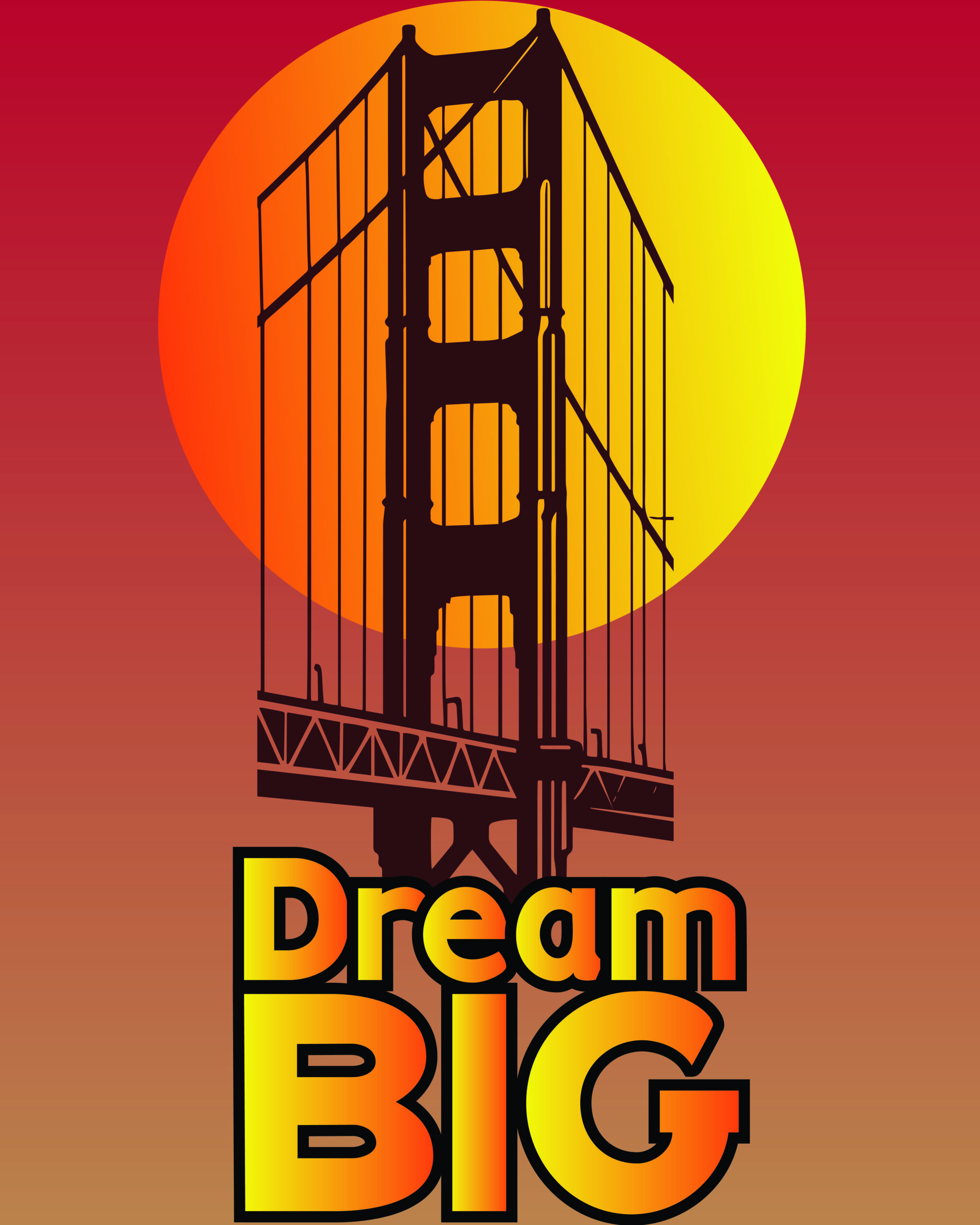
– California: Golden Gate Bridge + Dream Big
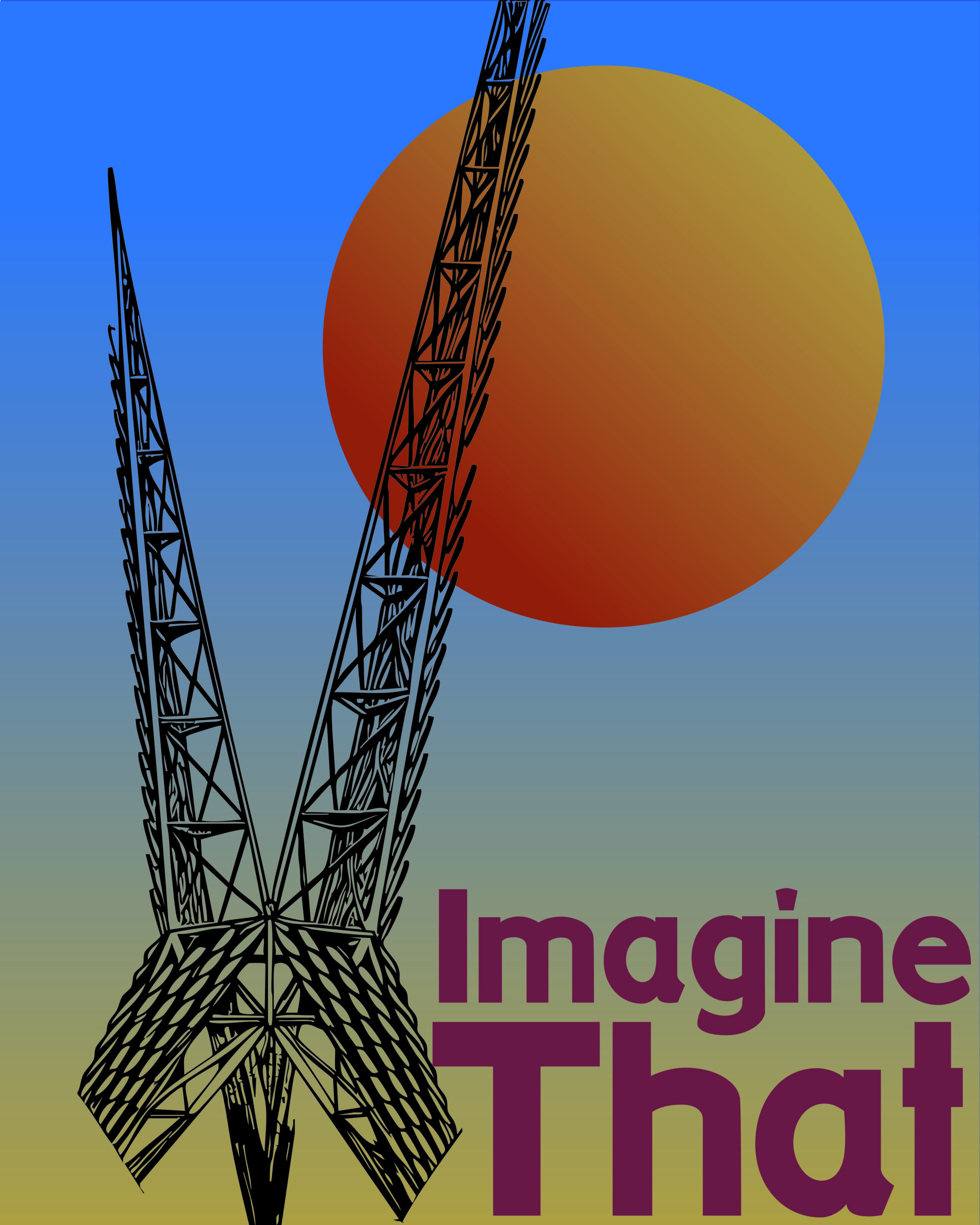
– Oklahoma: Skydance Bridge + Imagine That
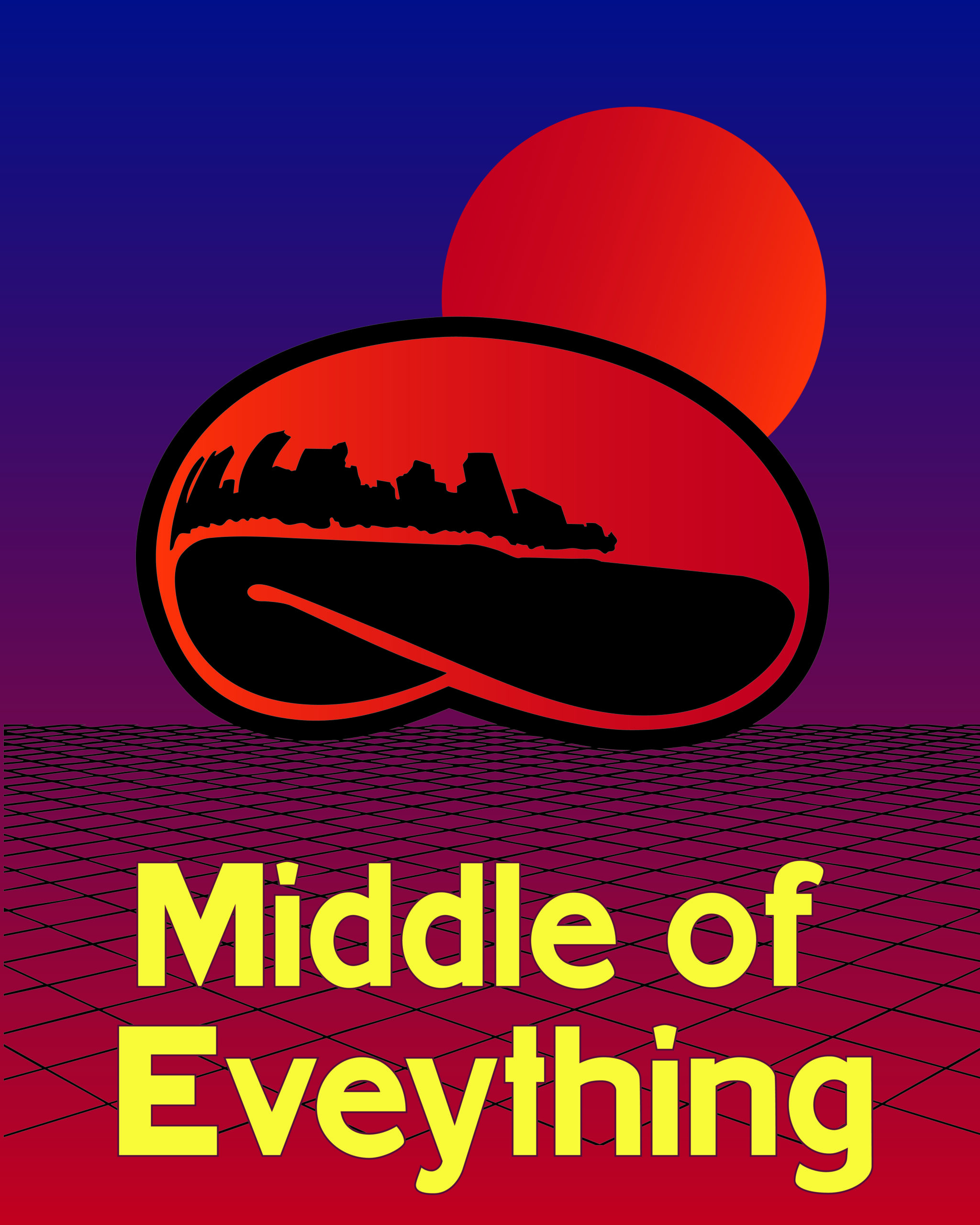
– Illinois: Cloud Gate (The Bean) + Middle of Everything
– Massachusetts: Bunker Hill Monument + It’s All Here
Final Designs
Each poster went through multiple rounds of digital refinement:
– Adjusting monument silhouettes for clarity and visual impact.
– Experimenting with gradient backgrounds to mimic sunset palettes, evoking warmth and optimism.
– Fine-tuning typography for hierarchy and legibility against bold colors.
Takeaways
This project challenged me to work within brand guidelines (state slogans and colors) while keeping creative flexibility. I learned the importance of visual consistency in a series and how color and type can convey place-based identity.
Leave a Reply